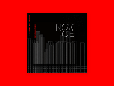
NOVICE - Amateur in disguise
Heyo.
New year, new designs! The more of these I do, the more I'm finding it easier to express ideas I have. I guess after a while you get over your fears of "will it be bad" and can just focus on making anything that comes to.
It's hard to translate what you see in your head through on screen. There's so much that can change. Sometimes it's a good thing. I like how there's this appearance of a separate layer between the "buildings", making sorta pop out at you ever so slightly.
Right now I've been having a lot of fun playing with lines and rectangular geometric shapes. As well I've been focusing on modifying text more and more. It's a bit small to see, but I gave a serrated look to some of the placeholder text I've made.
In some ways, I wanted a dark and moody feel. Like an urban noir film. Ever watched Pi by Darren Aronofsky? Great inspiration for this design. A great film too. But a weird one.
Enjoy :)
