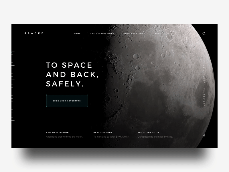
SPACED Pageload
'Sup guys
Here's my first shot for the SPACED challenge that @Dann Petty is hosting. Awesome contest, i want to encourage everyone to be a part of this. Cool to see how much Dann gives to the community.
Had the best time working on this concept, i designed a full page aswell, i'm posting that tomorrow. Working on a paralax scroll effect too for the full page.
The main vibe i wanted to create is a not cliche vibe. Most of the time these things have like dramatic music with it. In the bottom right corner you see that there's a audio icon so i want to have music on this site that is a bit more like kind of a guardians of the galaxy vibe but then a bit more modern. I would have this song when coming on the site. PLAY MUSIC
With this kind of music and a bit of different copy i want to create the 'cheekyness' that is explained in the brief.
UI elements are inspired by the great work of GMUNK for oblivion. The bar on the left would be fixed while scrolling and the colored line would slide down to give the user a feel of where he/she is on the page.
I hope you guys like it. Be sure to go check out the challenge, you can win a MACBOOKPRO. 💻🙌
Longer animation video in attachement aswell as the design.
#SPACEDchallenge
Have a great day guys!
Peace✌️


