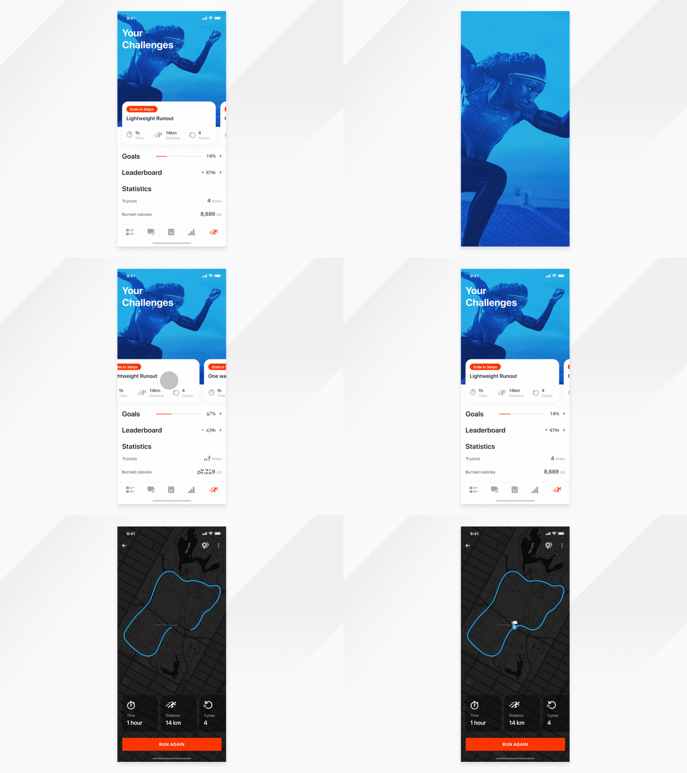
Fitness app - Challenges
We used to design simple and static designs, then we pushed our limits and tried to see how it all works through prototype products such as InVision and Marvelapp. But that wasn’t enough for us so we begun with simple icon transitions, hovers, various card swipe and at the end we added more complex ones that show user’s interaction, micro-animations and transitions from one part to another. We started to improve usability of our products.
Today it became necessity for most of us to think of not only UI and UX while designing but also animations we would like use. Just raise your comments everyone who finds yourself thinking of animations already in the wireframes stage . How you could do that fancy Ease In, Out on the cards and show it to client and fellow designers.
If you are asking yourself; whether, you should start thinking about interactions already while designing, our response would be certainly. The job of a designer is not just to make a website or an app functional; but also to make it enjoyable for the user. The advantage of an animation is that it can solve problems in design by showing relationships between various elements, thus making it more understandable for the user.
You can read more about that in our blog post.
And.. well… if all the above doesn’t work for you, you can still make animations to impress fellow designers :)
Give some love to our wonderful motion designer @Lukáš Straňák who animated this while I am still learning.
Check out more of our work here
Don't forget, the world could always use more animators.
