Bubble Chart
The bubble chart is used to represent data sets with 3 variables. It is plotted on a 2-dimensional plane, position of a bubble on this plane indicates 2 of the variables, and the 3rd variable is indicated by the area of the bubble. All the bubbles are circular in shape. Bubble charts help a user get an idea of the relative size of the data and compare it visually without the use of scales.
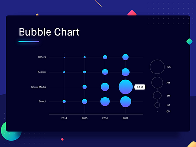
Let’s plot the traffic on a website via various channels over a period of four years. The years are plotted on the X-axis, and the channels are listed on the Y-axis, and bubbles are plotted at the intersection of the two. The size (area) of the bubble represents the traffic. It tells us that the website probably did not have a social media presence in 2014. However, in 2017 social media was the largest source of users for the website. This way bubble charts can be really insightful by helping the user derive trends, and allowing the user to compare two sources at the same time.
Best Practices for Bubble Chart
1. Generally, the value represented by a bubble is accessible via a hover, but in cases where such interactions are not possible, provide a bubble size vs value scale along with the chart (as shown on the right side of the bubble chart).
2. Space out the bubbles when plotting the chart, however, if that’s not possible make sure you show the overlapping bubbles by changing the opacity of blending mode of the bubble.

