Clustered Force Layout
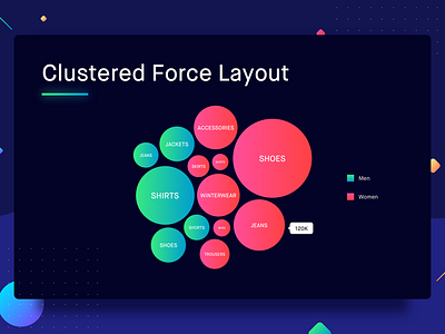
Clustered force layout, also known as clustered bubble chart is used for comparison. Categories under comparison are represented by circles and these circles are plotted close to each other as if forming a cluster of circles. The area covered by each circle is equivalent to the variable under comparison for the categories. When representing clustered force layout similar categories are kept in one cluster. The various types of clusters can be differentiated with the use of different colors as legends. One of the most popular examples of clustered force layout is a screen on Apple Music where you pick your favorite genres.
Let us plot a clustered force layout to understand this better. The example below shows the most searched for products on an e-commerce platform. These keywords are also categorized into which categories they fall in using different colors. Well, looks like a lot of women have been looking for shoes.
Best Practices for Clustered Force Layout
1. Make sure that the text on the bubbles is readable on the interface.
2. Provide a scale of bubble size vs value for better understanding whenever possible. (Check out the example of bubble chart below)
3. You can have multiple levels of clustered force layouts (nested clustered force layouts) which can be accessed by a click/tap. However, if you can highlight the categories using legends, prefer using legends over nested clustered force layouts.

