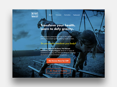
Design exercise–course landing page
This is a landing page redesign I recently did for a UX design challenge. The problem was one with information overload: a course page packed with dense text impossible to scan. It takes some heavy tweaking and prioritizing to come up with a clear page design optimized for scanning with intentional pauses
More by Lucia Ziyuan View profile
Like
