Scottfree Salon
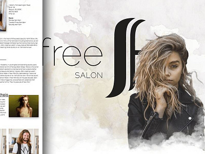
When we first started this project, they wanted something with texture, and edge, but also something soft and feminine. We came up with this watercolor design, and actually really liked it. But the more we got into it, the more it became an ultra minimal layout. Check out the second shot to see the final version.
Check out the full site at http://scottfreesalon.com
More by Sam Daugherty View profile
Like


