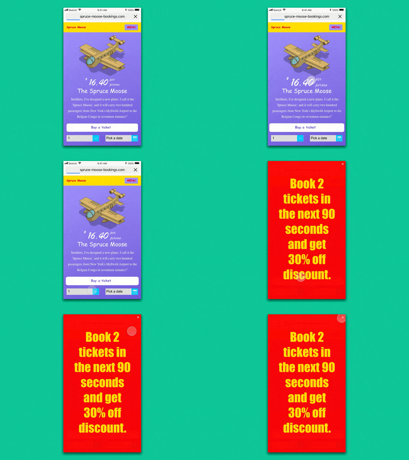
Spruce Moose Mobile Booking RAGE!!!
Too many different font styles, inaccessible colours that make it extremely hard to navigate, different form input styles and are really small so nearly impossible to tap followed by a full screen modal call-out triggered automatically with 'fake' urgency discounts applied with a tiny 'x' close icon so you get stuck in a absolute rage!
I channeled my inner-rage inducing design for an eCommerce website trying to get a booking by doing everything over the top which results in user-rage!
More by Ben Low View profile
Like

