Baltimore Ravens

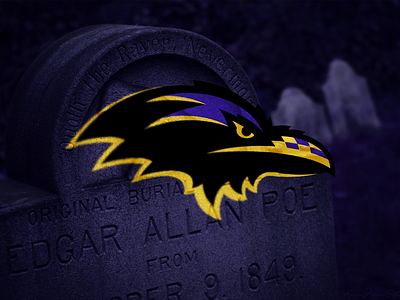

I wanted the Ravens logo to feel more like the Carolina Panthers logo: a black creature coming from the shadows, only the highlights lending an idea as to what was really there.
I also wanted to put that much beloved Maryland/Baltimore flag in there, but not go Maryland Terrapins over the top with it, thus the beak.
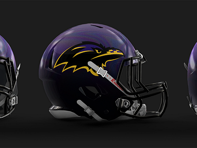
In the attachment you can see my helmet idea for a logo like this. A black to purple irridescent helmet - not too over the top - with metallic gold highlights.