Apple Finance - Concept - Shot no. 2
Following up with an interaction design piece from my Apple Finance Concept.
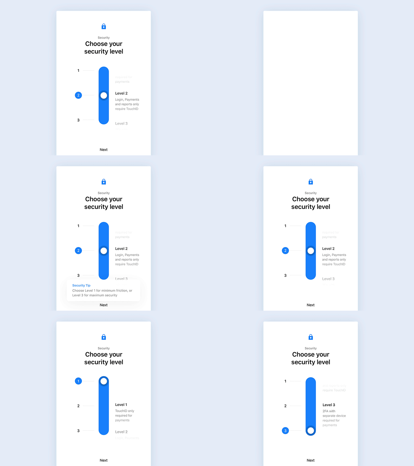
This time, we are looking at the security setting screen which appears when the user first uses the app.
Financial and Banking apps are always a challenge. They need to satisfy a user segment that prefers frictionless, easy and rapid access to their balance and transactions, as well as a - usually older - segment of users that prefer multiple security layers over ease-of-use.
By giving the ability to personalize the security level, users have the power to choose how much friction and security they want based on their needs, by toggling Touch/Face ID and Three Factor authentication for viewing balances and doing payments.
View the Case Study on Behance | Press L to share the love!
