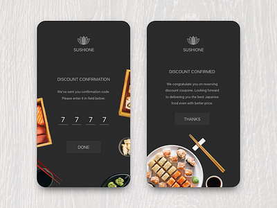
Confirm Reservation - Daily UI #054 - Freebie
Here is design concept of discount reservation confirmation. I was always wondered why confirmation screens are always so boring? What if we will start making then as tasty as all other screens. Cause client wants to see beauty everywhere, not only on homepage. Also keep in touch — I want to create design template for Japanese food restaurant. Their cuisine is so beauty and it is so pleasure to produce something interesting to it.
Would be nice to hear your thoughts about this concept. Likes are welcome =)
If you find something useful — you can grab source sketch file (free to use). Comments and likes are welcome.
You may grab source sketch file (free to use) here:
http://dailyui.bova.me/challenges/ui-54.html
Hope you like this concept. If you have any thoughts — you are welcome to contact me.
