Mount Blanc Internal Redesign
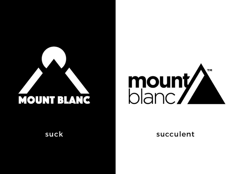
The concept of using this mark’s negative space as a white mountain, while interesting, decreases the mark’s overall effectiveness.
Also, The mark loses its legibility when scaled smaller.
The rebranded mark focuses on creating a strong shape that is recognizable. The previous mark’s concept was scrapped for a more mature and refined look.
The rebrand reorganizes and compacts the contents of the mark allowing the mark to scale effectively.