Coworkies Logo

Making a new logo design for Coworkies.
Last year we traveled to more than 20 cities to explore the coworking spaces. In total we visited 255 so far. As now I am back in Berlin and spending more time on the website I saw few flaws in our visual communication.
I realized that we need a symbol that is different from our current logo illustration, which we are still going to use in our communication. Yet, we need a simpler symbol to be used on the website and other places where the bigger logo illustration is not a good fit.
The story
So in short on Coworkies professionals from different coworking spaces can connect and collaborate on different jobs and projects. For example a designer might need a developer. On Coworkies s/he can brows the coworking spaces in the city and find one that fits the project and get in contact.
Logo Idea
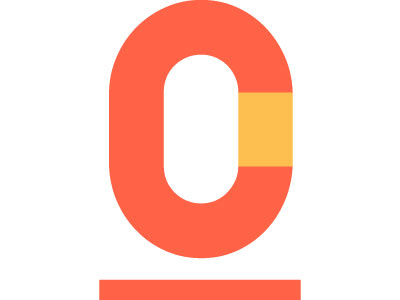
The ideas is to combine the main letters C and O in one element. CO corresponds not only to our name Coworkies, but also to coworking, collaboration, cocreation. The line beneath is to represent location as we see our platform as local first. The levitation for me shows the overview of the platform where people from different spaces, cities, countries can connect to work together or get a coffee for that matter.
More about the project can be sen on https://Coworkies.com