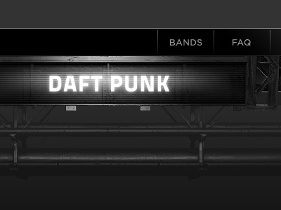
Rock Concert UI
Very beginning of a work in progress. This is going to be a extremely detailed / complicated website designed to look like a rock concert stage. The band name, seen here, will actually be editable/dynamic, as will a lot of the data on the page. It's fun to design, but it's going to be very annoying to code, haha. Psyched to see how this will progress over the next few weeks.
This is in B&W because it's easier to mockup without worrying about color. The final site will certainly have some color.
More by Rob Loukotka View profile
Like
