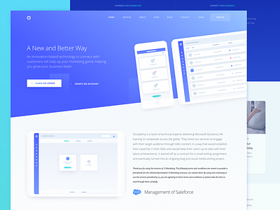
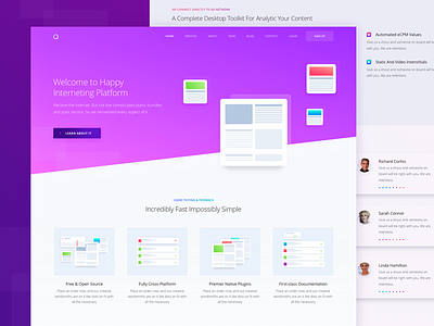
Inner Service Page Design for Marketing Website
Hey there!
Here is another page of a marketing website that showcases the company’s inner service. The service is based on an innovative technology that provides a new and better way to connect with customers. We’re creating this website for a client of ours that shall remain nameless whose business offers a full stack of digital marketing services that match the needs of small and medium-sized businesses alike.
Goals: creating a page that would introduce the service to potential clients, outlining its main advantages and core features. The requirements were for it to be vibrant and “live”. Something we had to pay great attention to was the customer journey on the page and the entire website in general, so people could actually find what they were looking for. And we all know what that is - helping them solve their problems or fulfill their need.
Approach: We jumped at crafting effective needs statements after talking to our client. We discussed their target audience, created their use cases, and based our structure off of that. References to websites utilizing heavy gradients and custom content were the springboard for our decision making in UI design, as that was the feel that the client wanted their website to have, so we humbly followed.
Solution: After studying the target audience, researching various references, thinking out the customer journey map, we ended up with a live and vibrant website, that showcases the business solutions provided by the client of ours, and that speaks to the target audience.
Let us know what you guys think about this one!
Press “L” to show some love!
Don’t forget to follow Zajno on social media and feel free to drop us a line:
Facebook | UpLabs | Twitter | Instagram | Zajno | Medium


