Fit & Fill: Icon Design Process
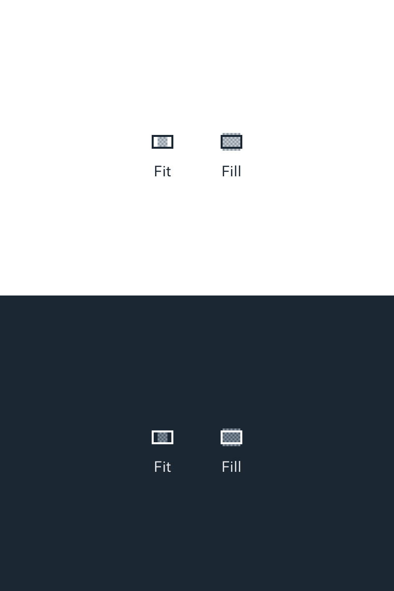
When cropping an image or displaying it within a fixed container, it's helpful to have shortcuts to fit and fill the image. Fit ensures that all of the image is in view, even if there's extra whitespace around it. By comparison, fill increases the size of the image until there's no remaining whitespace, masking whatever doesn't fit.
Most icons poorly represent this concept.
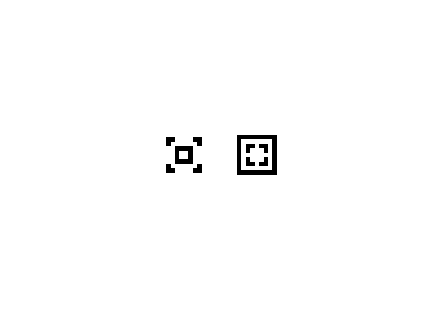
- Arrows seem like a natural solution at first. But they're easily confused for expand/collapse actions like full screen. We could try to fix that by adding a container around the arrows, butttt that doesn't improve communication much, since it's not clear if the arrows refer to the container or the image.
- We could put two mountains in the middle to represent the image being modified. But somehow we need to show the image "invisibly" extending beyond the bounds of the container... which gets messy at this size. If we try to hide the invisible parts in the fill icon, the fit icon gets some columns beside it to represent the whitespace, and it's not clear why they are there.
- We could try something more abstract... maybe with 4 detached corners, like when you hold your hands at angles to frame a scene. But it's too easy to confuse one icon for the other. Either could mean either.
Thus, our final solution:
- The container gets a strong border and doesn't change size, to emphasize that it's static.
- The image gets a crosshatch pattern to maintain presence across the container's bounds: a solid shape would become "detached" above and below the container.
- Intentional aspect ratios for the container and image show off the whitespace in the fit icon and the overlap in the fill icon without making either drastically larger or smaller than the other.
- The only thing left to do is to correct the optical illusion that occurs when we use continuous hatching. We can do this by reversing the outer hatching on the fill icon.
If anyone ever tells you icon design is easy, they're lying.


