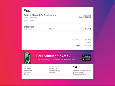
Resident Advisor Receipt Redesign - 017
Will someone tell me if I'm gonna get in trouble if I keep doing these daily UI challenges based on existing companies? I'm really not trying to get sued.
Anyway, here is a quick redesign for the receipt I got in my inbox from Resident advisor. Their style is pretty normcorish. I really don't know how to describe it, but it's clean and simple with splashes of color here and there.
More by Che Harvey View profile
Like
