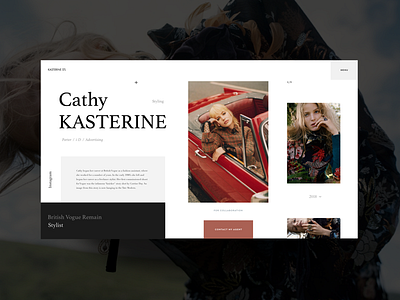
Stylist Home Page Explorations
Hello friends,
It’s time to take a shot break from animated shots and showcase something static that I’ve recently designed. Today, it is a homepage for a promo website of an award-winning stylist. Following most up-to-date web design trends such as usage of whitespace and broken grid, my key focus was to keep the overall look rather minimalistic and showcase the beauty of author’s works.
I think it came out pretty neat and stylish. Eager to hear your thoughts on this work of mine. Your feedback is always appreciated :)
Cheers!
P.S. Remember to check the attachment.
Press "L" to appreciate it
More by Synchronized View profile
Like

