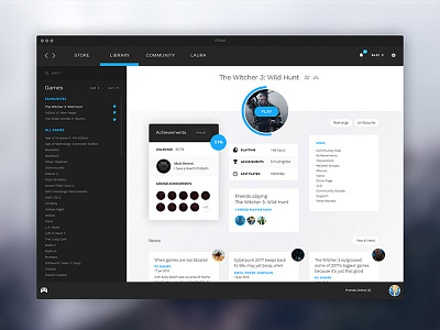
Steam Library Redesign - UI/UX focus
I wanted to redesign the Steam UI with the user in mind - this time, the Steam Library / Game page.
The original game page is a bit bland and uninspiring. I turned it into more of a 'dashboard' design where you can see how far you have progressed in the game at a glance, gamifying the experience.
User experience updates:
- Created a moveable 'dashboard' interface.
- Added a 'gamification' element to the achievements (the progress bar, the percentage clearly visible).
- Ability to rearrange based on which items you use most, e.g. achievements, friends.
- A cleaner, flatter design with less colour - more focus on the games.
- Less text, more icons - this target market is more familiar with icons.
- Add to favourites - while you are playing a game you want it to be available at the top rather than searching through a list every time.
- Updated the layout of the news, included a small image.
- Cleaned up the chat, kept it in-window unless opened in it's own window.
Let me know what you think! Please check attachments for full versions!


