Grouped Bar Chart
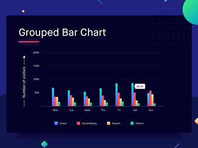
Similar to a bar chart where we compare two categories on the basis of one variable (which is represented by the bar), grouped bar chart allows us to represent a comparison between two categories on the basis of multiple variables (multiple bars grouped together). It’s important that all these variables can be measured with the same unit as these variables will be plotted against the same axis.
Taking the same example as that of the stacked bar graph, the visitors on a website can be represented with grouped bar charts too. In this case, every bucket (social media, direct, search & others) gets a bar of its own. All these bars are plotted against the Y-axis which would give the number of the visitors.
Best Practices for Grouped Bar Charts
1. The groups under a category need to be limited to 4. Representing too many groups can make the graph unreadable.
2. Two groups of bar charts must have a good margin between them in order to easily differentiate between the groups.

