Steam Store Redesign - UI/UX focus
I wanted to redesign the Steam UI with the user in mind.
Once I started wireframing the site I noticed just how cluttered and information-overloaded it is! There are so many ways to get to the same content which I find confusing and a bit unnecessary. For me as a user, I view the featured games, sale and occasionally browse through recommendations; if I want anything else I will use a menu or search bar.
User experience updates:
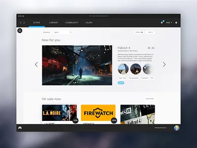
- A cleaner, flatter design with less colour - more focus on the games.
- Less text, more icons - this target market is more familiar with icons.
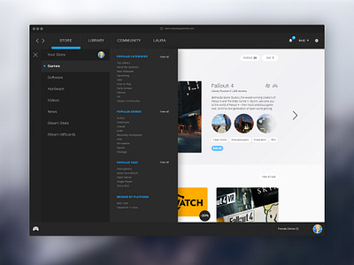
- One main store navigation with clear hierarchy - the excess of links, menus, buttons etc gives the user too many options.
- Menu closed by default with a hamburger toggle - it is not necessary to have the menu open all the time especially with such a large menu.
- Created a cleaner cart, wishlist, search and browse area.
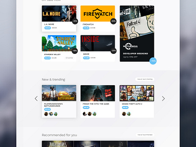
- Changed wording from ‘Special Offers’ to ‘On sale now’ and made it a primary focus.
- Added a ‘New & Trending’ section showing what friends are interested in, making use of crowd mentality.
- The end of the page is game recommendations for the user with an endless scroll feature; they can browse for as long as they please.
Let me know what you think! Please check attachments for full versions!
Currently redesigning the Library page :)


