Stacked Bar Chart
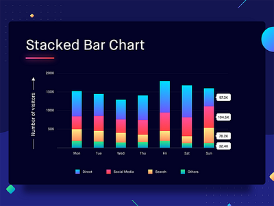

Stacked bar charts add a new dimension to the regular bar charts. This chart also shows the composition of a bar. Legends are used to differentiate various constituents of the bar. Now that might sound complicated, so here’s an example.
Let’s say that in the previous graph, we have to show the sources of visitors along with the number of visitors on a website. There are 4 main buckets from where the users might arrive at the website — Social media, direct, search & others. The sum of visitors via all these buckets would be the total number of visitors. Here the 4 buckets are represented with different colors.
Best Practices for Stacked Bar Charts
1. The groups under a category need to be limited to 5. Representing too many groups can make the graph unreadable.