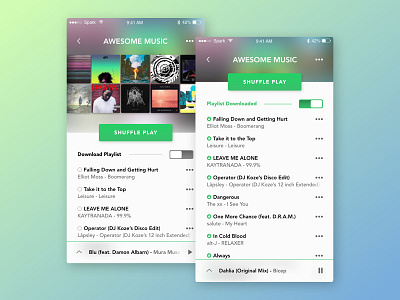
Spotify UI Redesign Concept (Part 2)
As a religious Spotify user I’m constantly evaluating the app’s UI and my personal user experience. My redesign concept focuses on applying a lighter colour palette that also incorporates the colour of the album art for each song. The player screen is also designed to place more emphasis on around the music, and the buttons have been rearranged to suit my personal usage. I’ve also replaced the rounded edges of the current UI with more rectangular shapes and shadows, which more effectively complement the lighter colour palette.
More by Thomas Williams View profile
Like
