ICYTAPE
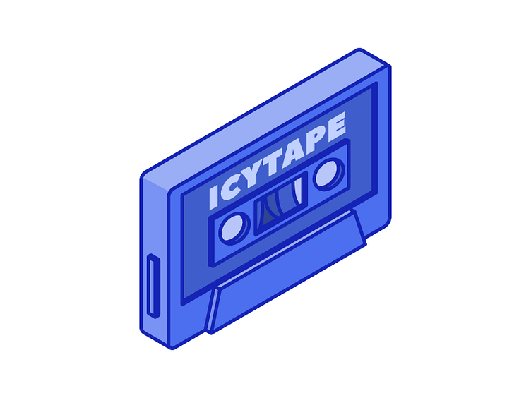
Logo variation for ICYTAPE. The idea was ditched because it doesn't look good in small sizes, but I still got a cool illustration.
Logo variation for ICYTAPE. The idea was ditched because it doesn't look good in small sizes, but I still got a cool illustration.
