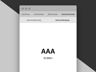
Color Blindness Controls
The titlebar and colorblindness controls are designed to step in brightness towards the preview. I'm trying to be a bit aware in the language I'm using in this bar, opting for "common" rather than "regular". That said, the actual color blindness terms are sort of obtuse, but I wonder if that ultimately matters. I envision that people would want to check to see if their color pairings work for most cases of color blindness, rather than getting hung up on a particular form of color blindness.
More by Jae Hanley View profile
Like
