Bottom controls styling
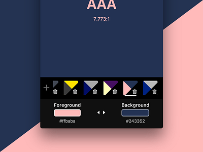
So the swatch saving feature is new. If you are currently on a particular swatch, it gets a white bottom shadow to indicate that it is active, and when any swatch is active, the ability to add swatches is disabled and denoted by the plus icon being given a lower opacity.
I made the choice to remove dynamic color backgrounds from the bottom section because I wanted to avoid undue color interaction between the swatch colors and the background. Because the bottom section that controls the background and foreground no longer has a dynamic color value, I've added a small border around the swatch input itself to help keep the colors distinct from the backdrop.
The difference in background colors between the two rows is rather faint, which I personally like, but I wonder that it is too subtle, especially for those with uncalibrated monitors, or monitors without a wide enough color gamut.
