Bar Chart
A bar chart is a type of column chart commonly used for Comparison. The bar chart works with two variables — one is the length of the bar and the second is the position of this bar on one of the axes. The bars can be plotted vertically or horizontally on a 2-dimensional plane. When various bars are plotted together, it’s easier to compare them, as the variable being compared is denoted by the length of the bars.
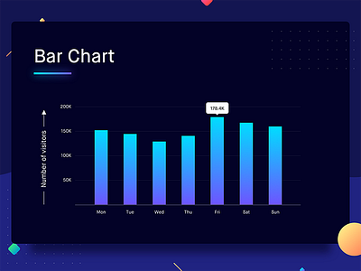
The bar chart can be used to show the comparison of one variable for multiple categories or comparison for value changes over a period of time. Given below is an example to put things in context. The graph shows the number of visitors to a website for a week.
On the X-axis you have the day, and the Y-axis shows the number of visitors. Every day has a bar of its own, and the length of this bar indicates the number of visitors on that day. Even before the users start to consume the data, they can decipher when they had the maximum and the minimum number of visitors.
Best Practices for Bar Charts
1. If you are plotting the change in a value over a period of time (days, months, years), always plot the time dimension on the horizontal axis.
2. In charts, time should always run from left to right.

