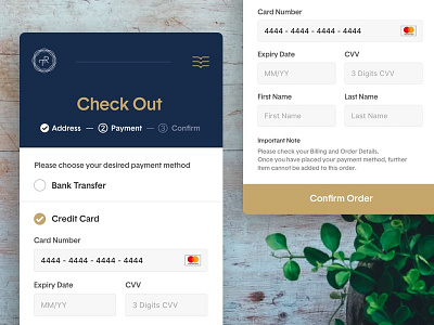
Daily UI #2 - Credit Card Check Out
I was about to give up today's challenge but my mind says that if I skip this one, I will easily skip for the following days too.
I realize that I spent a lot of time only to make a single page. The reason for that is I rarely practice in my spare time (other than not wanting to create a mere eye candy UI). I hope I would keep practicing from now on 🙏🏻.
This is a mobile web check out page design for an imaginary online bookstore Trilogia. Here's the logo for Trilogia: https://dribbble.com/shots/2761252-Trilogia
Background photo: Annie Spratt on Unsplash (https://unsplash.com/photos/bGdiuIyN3Rs)
More by Visien Vinesa View profile
Like
