Daily UI challenge #002 | Credit Card Checkout
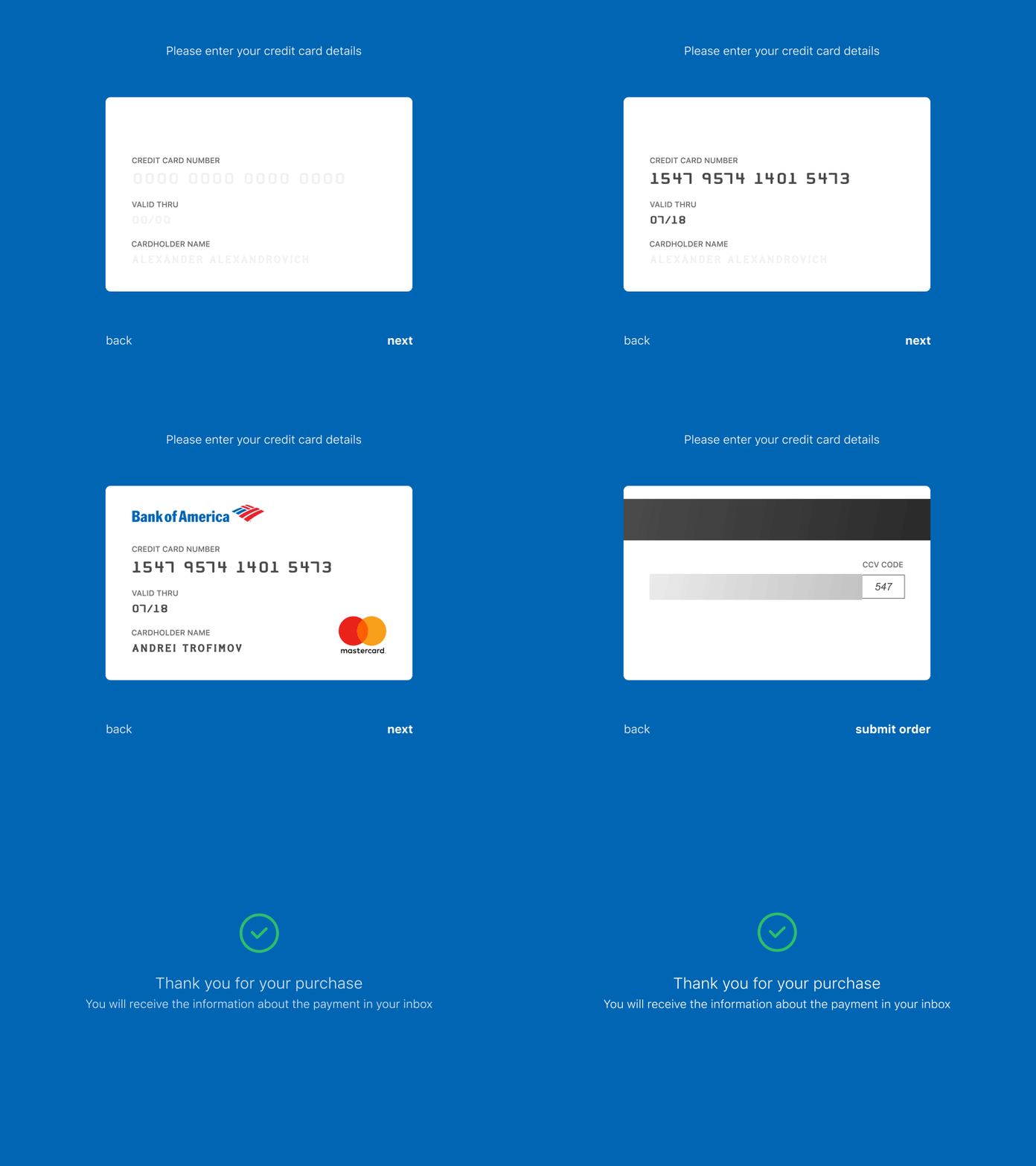
The interface shall be easily readable, especially, when we speak about such important part of the interface as payment. The interface is always clear to the user when we transfer object from real life in our interface. From there was a 3D-flip animation of the credit card. The name of bank and type of payment service provider is defined automatically after data input.
I know that division of input of the credit card details and a CCV-code into two steps is not the best decision from the point of view of UX, but it is an experiment.
What do you think about it?
Made with Sketch & After Effects (using Sketch2AE plugin).
More by Andrey Trofimov View profile
Like
