Mustsee Landing Wireframe
We’ve recently released a new landing page for our product Mustsee. The previous landing wasn’t simple and clear enough.
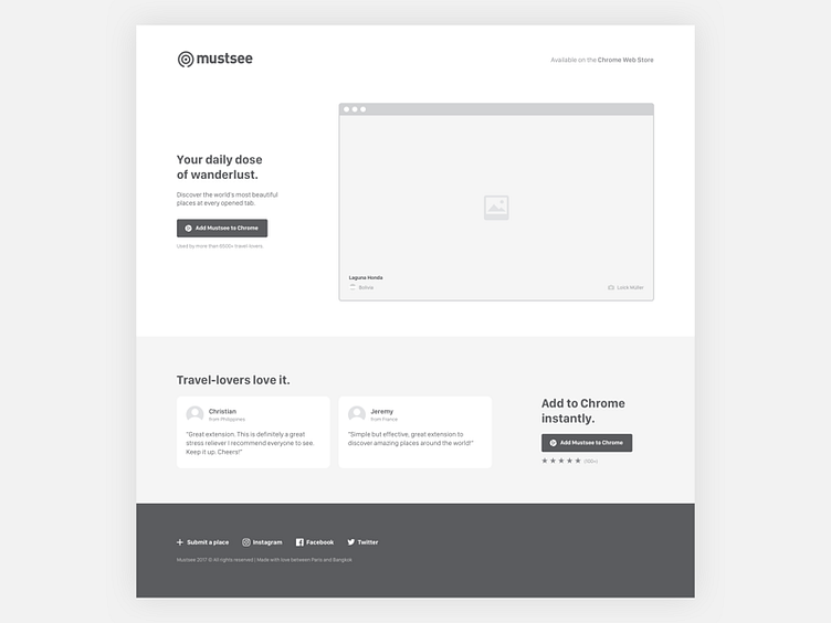
We’ve set up some clear goal. The new landing needs to: → be more straightforward: show precisely what Mustsee does → have a better social proof system: feature more reviews and highlight our 5/5 star rating → have a better copywriting: what: “Daily dose of wanderlust” ; how: “Discover the world’s beautiful places at every opened tab” → show the product advantage from competitors: highlight pictures which are only available on Mustsee. We don’t use photos from stock photos.
The outcomes are good: - we’ve a better conversion rate - people understand what does the product quickly
If you want to see the final result → HERE
ps: Florian posted few week ago some iterations about this landing → HERE
