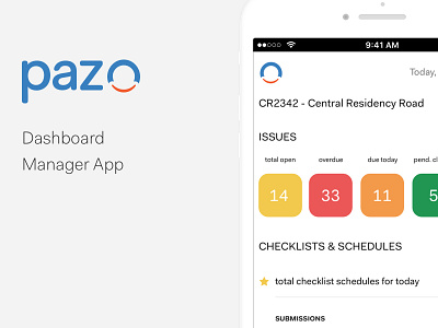
Manager App Dashboard
Key points we realized in the process:-
1. Soft color pastels - the manager's liked the effect of the soft colors on white canvas.
2. Simple icon shapes - helped with recall value of the sub-modules.
3. Clear information - the manager's welcomed this approach of showing information as it helped them identify the necessary data from the clutter.
More by Shabbir Hussain View profile
Like


