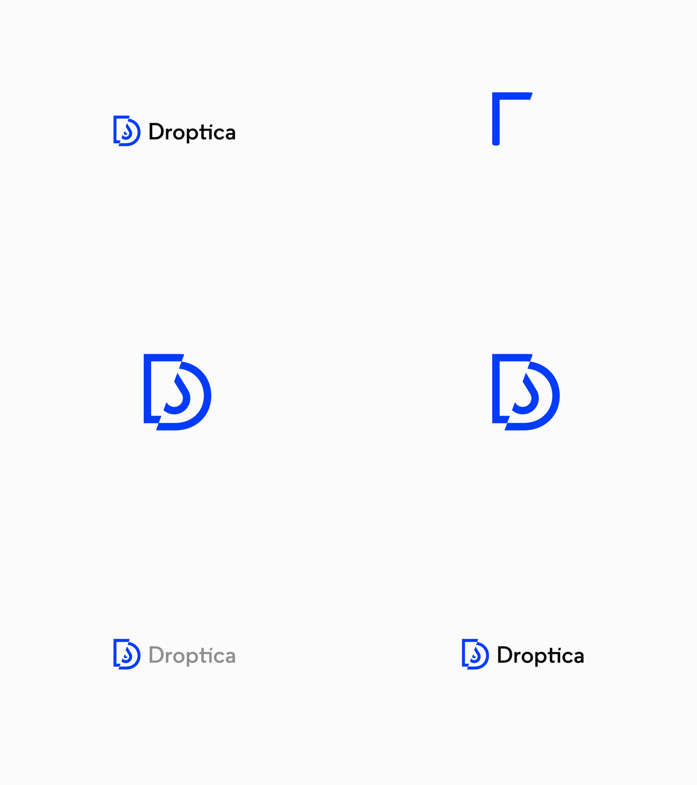
Droptica - New Logo
Hi Folks!,
We are excited to announce the launch of the new company logo and brand identity. It is a part of our ongoing development. Droptica has grown over the last years and we believe that our new brand is more reflective of who we are today and want to be in the future.
The new logo is more close to our precise nature and values we represent. It’s vibrant, dynamic and strong. To create the new logo we used three core symbols combined into one consistent sign. The drop means Drupal - the root technology which we use and which we are master in. The “D” symbolizes our name and the eye which represents our eyesight on technology, world changes and human aspect of our work. The dynamic form and brisk colors define Droptica as a strong and solid company.
We expect to be fully transitioned in a few weeks but let us already know what do you think! We are very happy and excited about our new brand. Hope you are too :)
Please let us know what do you think!
(stay tuned for more updates)
