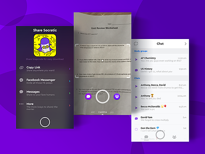
Socratic: Nav
In the effort of making social a "first-class citizen" in our app, the nav structure had to be completely reworked, resulting in a pulldown menu for inviting friends into the app, a lefthand drawer for chat, and a righthand drawer for groups. Keyboard inputs were pushed to the bottom.
Lots of inspiration was taken from Snapchat, particularly the complicated gestural system to let users quickly navigate between modes (I was actually pretty happy with how they turned out, especially the different swipe areas and how they felt natural).
More by Grant Anderson View profile
Like


