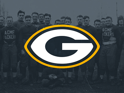
Green Bay Packers
This might be the least amount of effort I put into this series, but hey, it's hard to update a perfect logo (pardon my bias).
I've blued up the green, it's now somewhere between the Acme Packers navy and the current green. I've changed the shape to the football shape it was originally intended as, and I've fix proportions/made the G follow center lines in a cleaner way.
More by Mark Crosby View profile
Like

