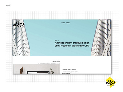
d51 New Landing Page
We updated the look of our business cards a week back, and just spruced up our website to keep it current with the new branding as well. We used imagery that gave it a nice spring look, modern sans serifs, and put our portfolio as front and center as possible to let our work speak for itself. Check out a live version of the site here.
I'd love to hear your thoughts and comments! Keep an eye out for more shots from this project and don’t hesitate to let me know what you think :)
Thanks!
Press "L" to appreciate it
More by Christopher Roberts View profile
Like
