Hawaii Emergency Management Redesign
Over the weekend, Hawaii Emergency Management sent out a false alarm claiming a ballistic missile was inbound to Hawaii.
The Honolulu Civil Beat shared a screenshot of the interface that caused the confusion. This reminded me a lot of the great article How Bad UX Killed Jenny.
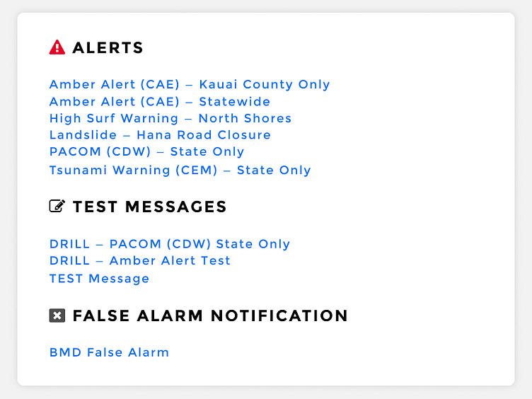
HEM's quick fix was to add the BMD False Alarm link at the top. A good band-aid in the immediate, but I wondered what other easy improvements design and design thinking could bring to the table. Seconds matter when getting these sort of alerts out, and the person sending the alerts should have the quickest, clearest path to do so.
I was curious if I could make some easy, attainable changes that could improve what exists. This design is a quick stab at that.
A couple items of note:
- All colors and sizes are WCAG AAA compliant. - Alerts, tests, and the false alarm notification are clearly delineated. - Alerts are placed highest on the page when an actual emergency is happening, someone doesn't need to scroll through tons of test alerts. - Icons are introduced to the headers. In a high-stress situation, this could help the user clearly zero in on the bucket they're looking for and not force them to skim the page. - I tried to stay as true as possible to the original content. I think some of the text could be edited, but that depends on what is best for the end user.
Anyone else take a stab at this? Leave it in the comments, I'd love to see what other people come up with!
