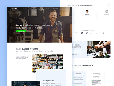
Increasecard • Landing Page
Hey folks!
We’re really excited to share the re-design we did for Increasecard’s site. The challenge was to get users to understand the service in the first scroll, so this was a bit more complex than a look-and-feel. We put a ton of effort into creating a cohesive, appealing storytelling throughout the site.
Hope you like it!
Here's some more Aeromagic for ya' ✨
Our website – Facebook – Twitter – Instagram
More by Aerolab View profile
Like


