Rochester Pioneers

Team 15/32 of #TheUFLProject – the Rochester Pioneers.
The Rochester Pioneers visual identity is built around the historical significance of Rochester, NY and its legacy as one of America’s first boomtowns. The city rose to prominence by building flour mills along the Genesee River, and later became a major hub to manufacturing and innovation. Rochester is the home of several universities with highly acclaimed research programs as well as major leaders in consumer products, like Kodak, Western Union, Xerox, and many others.
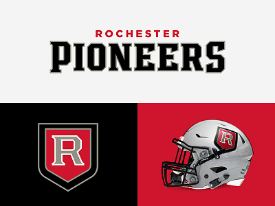
The primary logo is an elegant and confident block “R” in a red shield, emulating the visual attributes of a prestigious organization. The secondary logo features the Kodak tower, a 19-story skyscraper that has long been recognized as a landmark in the skyline of Rochester. The famous “KODAK” letters perched upon the top of the building have been replaced with “ROC”. The typeface is bold and athletic with modified serifs derived from the primary “R”.
(Also, I've decided to transition into using John Benson's excellent SpeedFlex helmet template, check out his work here! https://darth-brooks.deviantart.com)