Maggie Hyams — Wordmark Updates
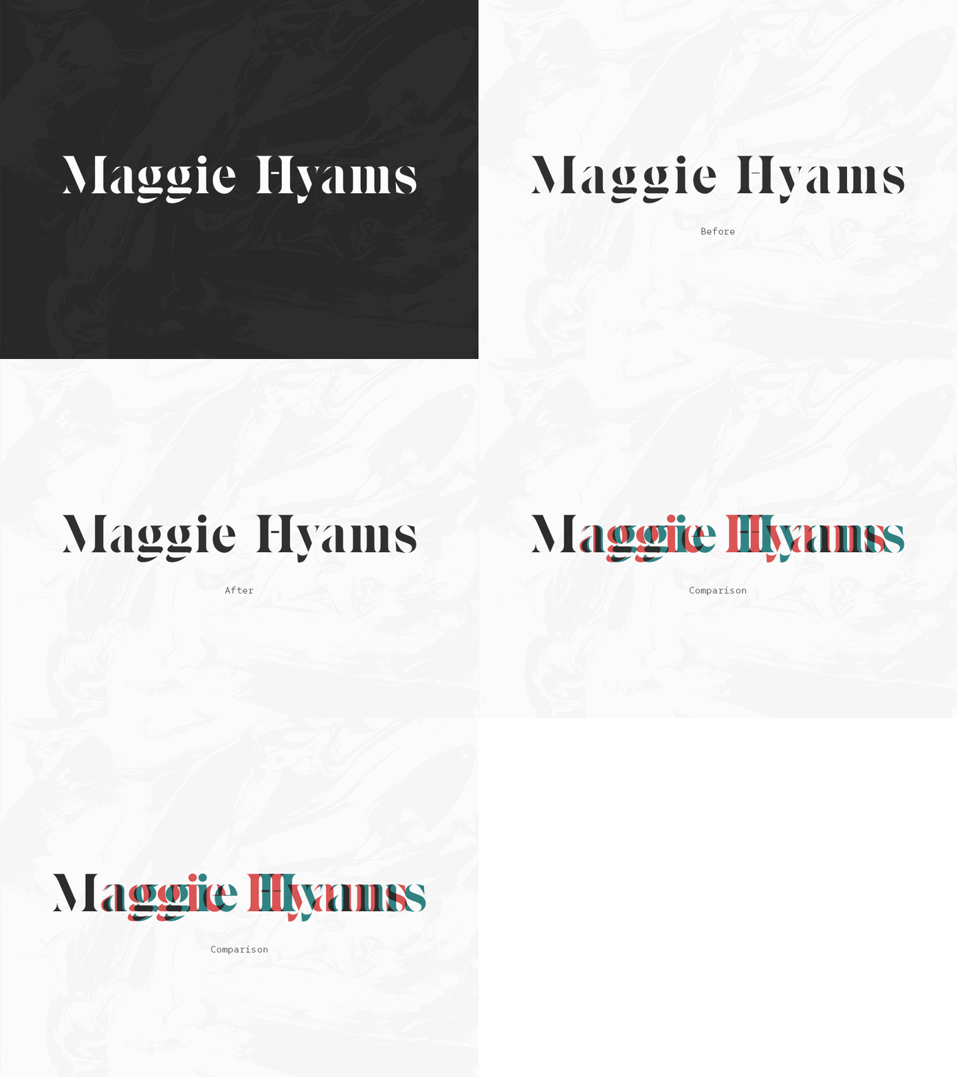
While updating my sister's website, I decided to take another look at her wordmark. The previous version was tracked out too far, and difficult to read as a result. Tighter kerning feels a lot better, and you can see how much horizontal space I've eliminated when compared to each other.
I also adjusted the thickness of the bar on the ‘H’, to match the ‘H’ in Maggie's primary logo.
More by Kyle Hyams View profile
Like
