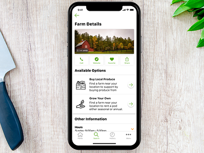
farmr - farm details
Company:
farmr | localfarmr.com
Preface:
Helps people grow their own produce and livestock at a nearby farm because they do not have the land for it.
Problem:
Design a screen that would show the detail information of a farm a user chose. Allow them to visit the farms website, call them directly from the app, and share the farm with their friends. The user must also be able to see if the farm offers buying produce, and / or renting a pod from the farm.
Solution:
I laid out the information using the nice thumbnail of the farm. Then following the same pattern as the search view I wanted to show the actions you could take on a farm. Seeing as how most users got stumped when user testing on what the actions meant, I decided to add text under each action so they did not have to guess. I then added the option available with description so the user could see what each action does before they buy local produce, or grow your own which was renting a pod.
Role:
I was in charge of the ui/ux design of the app design. I was not a part of a design team. I was the product manager as well writing story tickets and QA'ing the app from my team of developers to make sure my clients' app was realized to the full potential.
Tools Used: Figma

