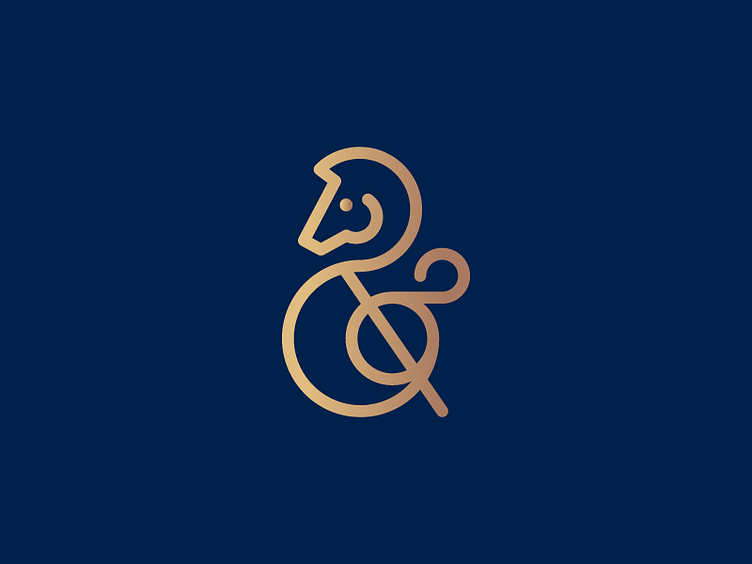
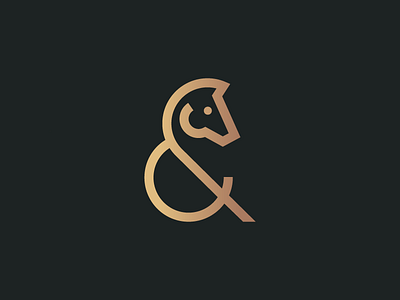
Horse Ampersand 2 - Traditional Look
I've been revisiting some of my older work recently and today I was reworking my Horse Ampersand.
I wanted to create a more traditional and calligraphic version of the logo (without changing the look too much).
To achieve this I've rounded the edges and tips of the strokes to give a more flowing feel as well as adding in strategic 'swirls' that don't compromise the overall shape. I decided to switch the horse's direction to allow the flow and shape to come naturally to the mark. ________________________________________________
More by Nick Budrewicz View profile
Like

