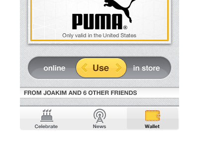
Use online/in store
We currently use two separate buttons labeled "Use online" and "Use in store". One problem some users run into is that they accidentally redeem gifts when they are not in the store, even though we prompt them with a popup explaining that the gift will expire and ask them to confirm their action.
Perhaps a change from a pair of regular buttons into a sliding controller will more clearly signal that it's something more serious? I think we should still prompt them to confirm the action. I'm glad to hear any thoughts on this!
Another thing in this shot is the "News Feed" tab change to just "News" and with a new icon that no longer looks like a podcast… Thoughts on this are welcome as well.
More by Max Rudberg View profile
Like
