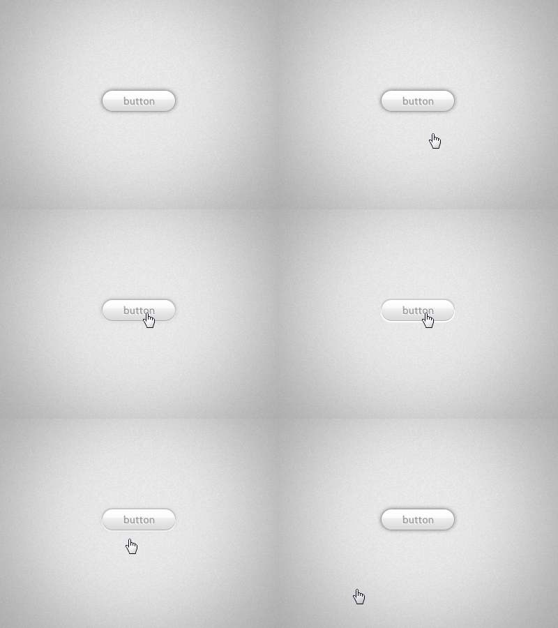
Glassy Gray Button
I've been working on finding the ideal hover and active states for a new glassy UI which will be incorporated into a new application UI here in the next couple months.
The animation is a slowed down a bit to show the different button states clearly, and the color is obviously just gray-scale for now, but I believe I have finally found the sequence I've been looking to achieve with this element.
Any feedback from you all would be greatly appreciated. A full UI set with toggle-switches, inputs, and checkboxes will come shortly! Thanks!
More by Jeffrey Jorgensen View profile
Like
