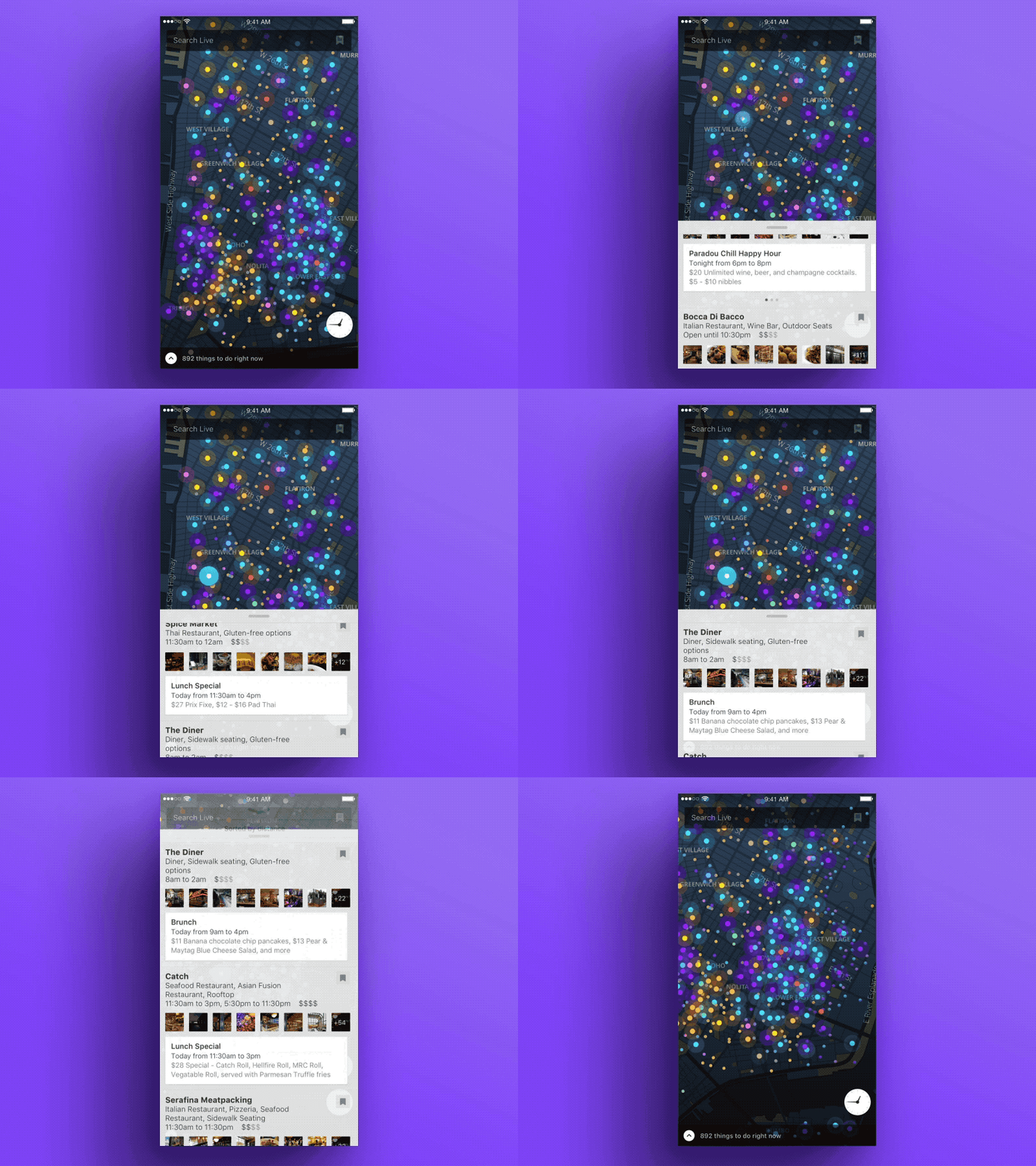
Live: Browselist
The browselist was meant to provide the ease of navigating a map, while getting a deeper peek into venue info, all at the same time in a mobile format. Lots of thought was put into the back and forth of these separate interface elements, from the automatic highlighting of a specific venue within the list to turning off auto-fetching more venues to preserve the list ordering.
The venues themselves prioritized information to the point that a user could potentially decide to go without accessing the detail page: multiple photos (both interior and exterior), venue metadata and attributes, the ability to save, and events. Users can also pull up to fullscreen the experience, providing an easy transition between both modes.
More by Grant Anderson View profile
Like


