Live: Map
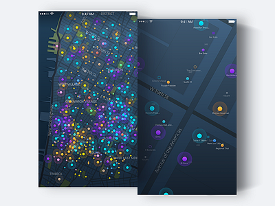
One of the best parts about Live is the map. Lots of time was spent trying to figure out how we could show users not just the popular places within a given view but *every* option available. Additionally, how could the concept of an event happening *right now* be communicated? And finally, how could it be designed so that it didn't overwhelm the user?
A dark themed map using a color system to communicate venue category and animated "halos" to signify live events was the preferred choice after much experimentation. Originally it was thought that forcing users to zoom in as a means to mitigate tap target overlaps would be problematic, but it actually proved to be a reasonable solution.
More by Grant Anderson View profile
Like


