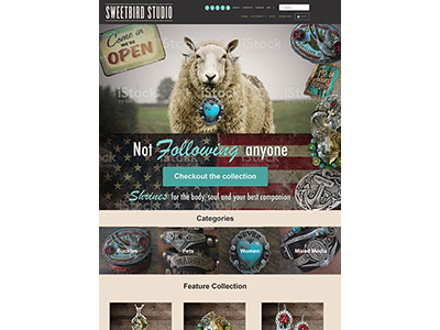
Sweetbird Retail Homepage Comp 3
This mock for a website redesign I'm working on where the client's brand is cluttered Americana. She tends to want the images on the site so busy, often to the point of taking focus away from her own products. In terms of this hero image, I'm open to suggestions on how to bring focus to the jewelry the sheep is wearing. She has asked me to impose a very busy background in the sky behind the sheep. I'm thinking of zooming in closer, but I can't get in too much closer without cropping the products on the sheep.
More by James Hummel View profile
Like
