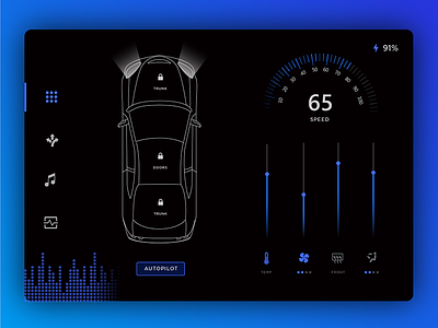
Daily Ui Challenge 034 - Car Interface
Today's prompt was to design a car interface. I don't have much experience with car UIs since mine is very old (1995!) and definitely doesn't have any digital displays. I wanted to redesign a Tesla interface because I feel like there were waaay too many buttons on the first Tesla interface. When I'm driving at 70 mph I need to know exactly what each button means without searching too much. This is especially important without physical buttons, because you can't just reach over without looking anymore. The Telsa Model 3 interface is a bit better- here's the interactive mockup if you're curious: https://projects.invisionapp.com/share/DPCUX2ETA#/screens/246644263.
I had a bit of trouble with this one. My issue was that there are so many buttons you need to cram into a small space, and I don't like a lot of the digital cluster examples out there. The first one I came up with had a neat color scheme, but I ended up not liking the layout at all. So I started over and decided to go for a more minimal layout with a simple grid and lots of negative space. I like the second one much better because it's easier to navigate, even if it's not as flashy as the first.
Check out what I'm posting on my other socials:
Youtube: https://www.youtube.com/channel/UCAncP7gtfX40MQGLYHEhpkg
Twitter: https://twitter.com/andreahock0
Instagram: https://www.instagram.com/andrea.hock/
Behance: https://www.behance.net/AndreaHock
Medium: https://medium.com/@andreahock0


