Restaurant Cards
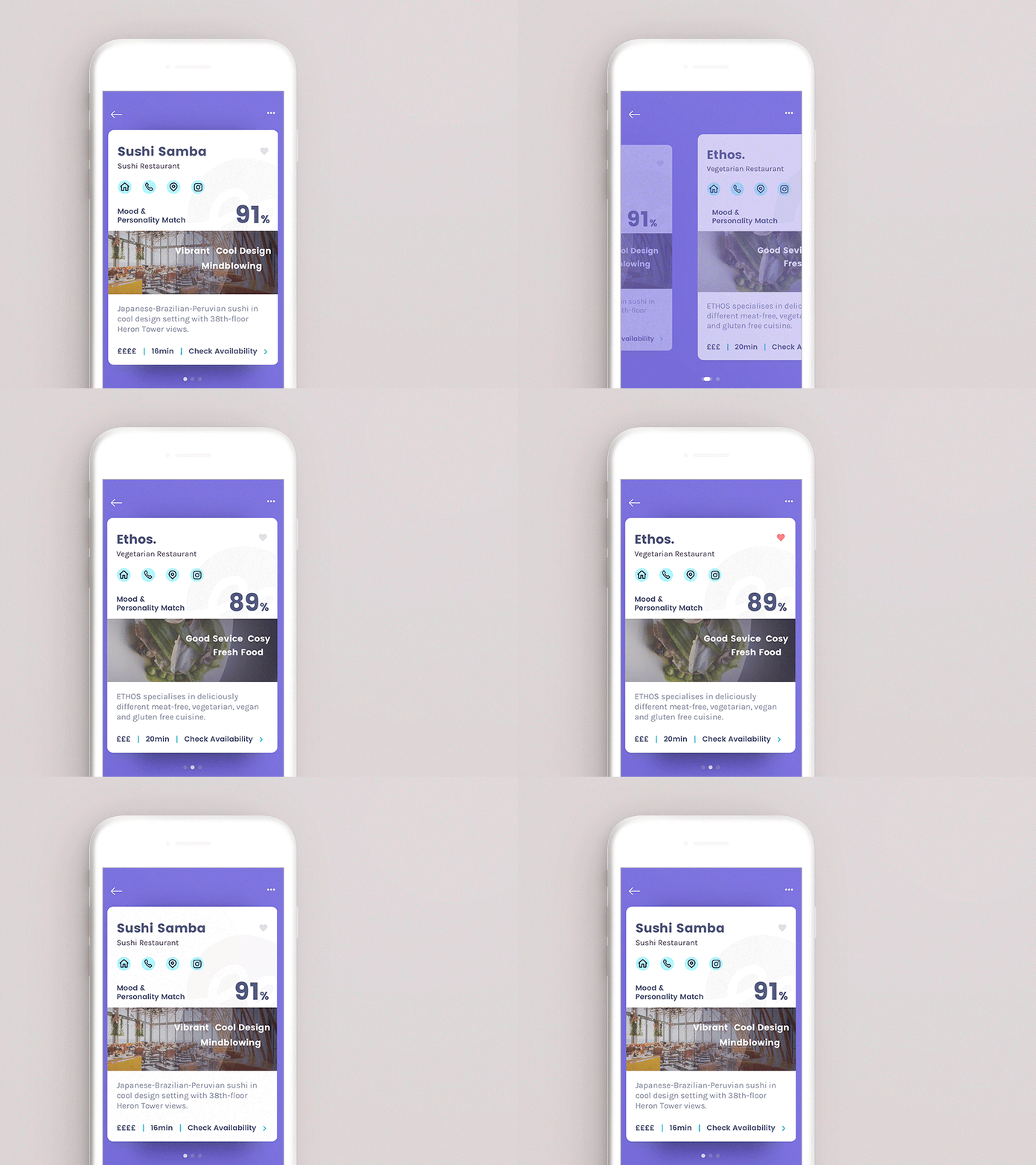
Another design and animation exploration for restaurant cards, this time the focus is on the score and matching keywords.
It would be fun to add an expanding card state where you can scroll for more details and longer descriptions. However this is not planned for the app since the user should not waste any time on reading but directly make reservations or check out the company's instagram.
Users should learn not to question the recommendations the chatbot provides and simply trust the numbers.
What do you think about the approach?
I am skeptical but also curious about user feedback because I think it's quite unusual and probably even more relaxed if you are not distracted by ratings and too much information.
More by Lea Delazer View profile
Like
