Pokémon Switch: Fantasy UI Concept
(See attachments for full-screen and high-res versions).
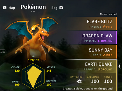
Mocked up what I'd like the summary screen for the upcoming Pokémon Switch game to look like. This screen shows the pokémon summary view for a pokémon in your party. The displayed state is an expanded view of the move details for the selected move. There's a whole bunch of information that could be displayed to the player on this screen, so I had to carefully pick and choose what the most essential ones were.
This was an interesting exploration, because the past four generations of mainline Pokémon games have been on a dual-screen console, which meant that all the UI was shoved down into a bottom touchscreen and the pokémon stats were shown on the top screen. The Switch will have to change up this formula significantly to adapt to its single screen and multiple control schemes.
Since the Switch is essentially one giant touchscreen, I figured it'd make sense to have two columns on either end of the screen, where the player can simply reach over with their thumbs and tap any of the blocks in a column to expand/collapse them or view their details (for a move, the ability, the held item, etc). Because using the touchscreen is not an option in docked mode, this would still have to work with the Switch controllers, and the control scheme shown here works with all orientations of the Switch controls. A decent amount of thought had to be put in to what the natural resting position for the hands were on the Switch and what controls would feel most intuitive to navigate through the UI quickly and efficiently.
I went for a minimalist typographic layout here with a lightweight feel, incorporating some gradients and layered translucency for easy scanning at a glance (both for when you're using it in handheld mode right up in your face or at a distance in docked mode on your TV), using color as an affordance for the pokémon/move type as the mainline games currently do. Drew some inspiration from existing Switch games such as Breath of the Wild and Mario Odyssey. The other UI elements like the stats hexagon were pulled straight from the existing games and given a visual overhaul. Tapping the “Judge Stats” button here would toggle the yellow section in the hexagon to display IVs instead of base stats. "Swap Move" switches the position of the selected move with another move in the list.
This definitely doesn't feel like it's something Nintendo would end up doing, but then again, they broke quite a few conventions with the Zelda game on the Switch (even with the UI), so who's to say they won't do the same with Pokémon? How cool would it be if they had a massive animated render of the pokémon in the center of the screen like this? I'm pretty excited for the game and really want to explore this concept further to see how the battle UI would work and how the overworld HUD would function. More coming soon, stay tuned!


