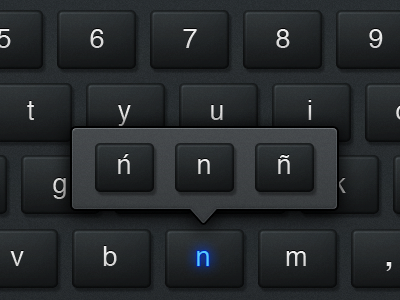
EXO UI 2.0 Dark Keyboard Test 1
Part of the project we did for EXOPC's EXO U.I. 2.0 encompassed creating a touchscreen keyboard. What an incredibly cool task right? So we took advantage of the situation and created not one but two keyboards. As tablet users ourselves we recognized that if you're tapping away on keys at night in bed or a late flight on a business trip, you're not going to want to stare at a bright keyboard.
This shot is an early test for the hover state of a key, plus it's popover menu to access the variations of the letter. Next shot will show or more vibrant active state instead of just a glowing LED-like letter. We felt as sleek as this looked, it just didn't register enough that you had hit the key so the blue is used as an "active" state and not pressed. Javier did the artwork and I did the nit picking (art direction).
© 2011. EXOPC. All Rights Reserved.
You can view our website at: http://www.theskinsfactory.com
